Rutgers AAUP Identity
The Rutgers Council of AAUP-AFT Chapters is a huge organization at a sprawling university: twenty-six hundred faculty, twelve thousand graduate students. Of these many are philosophers, psychologists, engineers and businessmen. The amalgamated nature of the union means the AAUP-AFT has never had a unified identity system.
Two things come to mind when one thinks about a university: its football team and its professors. Professors are the practitioners of education. As such, they are the bulk of the concept of a university. More than anything else, the AAUP-AFT is Rutgers.
While in one sense university is the sum of its parts, of which the professors are the most important, in another sense the AAUP-AFT is constitutionally opposed to the university. This sense is the university as employer, management and opposition.
Any identity for the AAUP-AFT must rectify the dual nature of the union as both core and nemesis of the University.
Preliminary Discovery
In developIng a logo for the Rutgers AAUP-AFT, e.d. design examined logos from across space and time.

Union logos of the world
The International Brotherhood of Electrical Workers logo demonstrates some archetypes of union logos.
The circle functions as container for the logo and connotes unity.
The IBEW circle has four concentric registers to contain its long name and supplementary information; a union logo cannot selectively exclude information without sacrificing part of its identity.
The symbol of the union sits in the center. The fist references labor struggle while the lightning references both the function of the electrical workers in the International Brotherhood and the Greek god Zeus, who most assuredly would not be pushed around by some fatcat.
Early Sketches
Early designs attempted to unify traditional labor imagery with traditional educational symbols. Thus: flame and gear, pencil and gear: far too many gears for an organization that is at most peripherally involved in sprocketry.


Perhaps too militant?
Better Sketches
Books never look good in logos. A lamp might well have a djinni living in it. A light bulb is too technological. Scrolls and quill pens are antiquated. Without resorting to a conglomeration of symbols of various disciplines (a test tube with a cow with a paintbrush) the only remaining symbols of education are the sun and a flame.
The Rutgers motto is “Sol iustitiae et occidentem illustra,” or “Sun of righteousness shine also upon the west.” The sun seemed like a fitting place to begin.

The Rutgers Seal, inspiration for the whole sun thing, a sun made of squigglies, a quick sketch that is definitely too tribal, and—some lateral thinking—a depiction based on a photograph of the actual sun.
The dot-star began with circles delineating the lobes of a five-pointed star. By filling in some of the empty space the starfish-looking thingie became a circle, or a sun. Thus the dot-star is a conglomeration of otherwise independent parts formed into a mighty whole. The sun is implied in the circular form while the five-pointed star is still visible in the matrix of small circles.
The homogeneity of the dot-star allows it to be recognized even if only partly shown, and for it to function as texture.

The descent of dot-star. From common pentagram to starfish to union circle
Final Logo
Most logos will need a couple slight variation for applications across various media. For the AAUP, e.d. design produced a Very Official version, for use on formal documents, and two casual versions, to be used as a signature or other application where the full name of the organization isn't necessary.


Applications

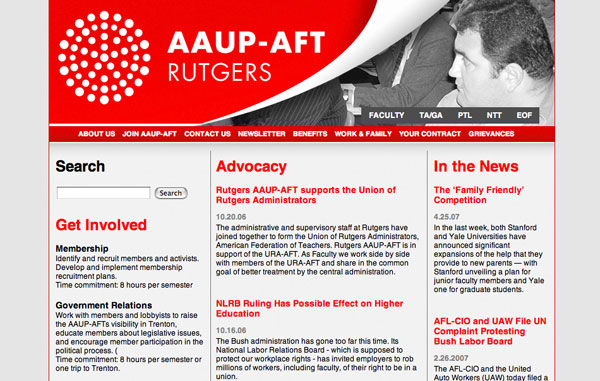
Web site

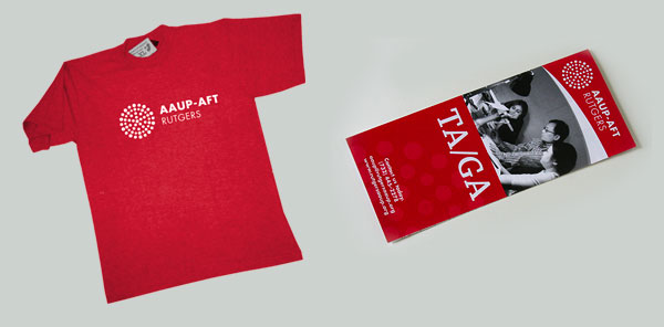
T-shirt and brochure