Lawrence Marek, Architect
Portfolio site for the New York architect.

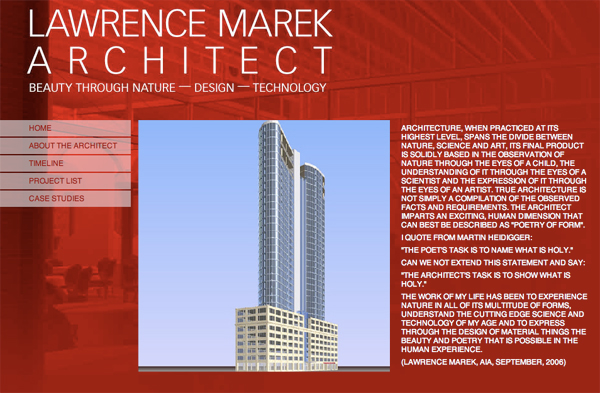
The home page uses an arresting red to create a sense of redness.

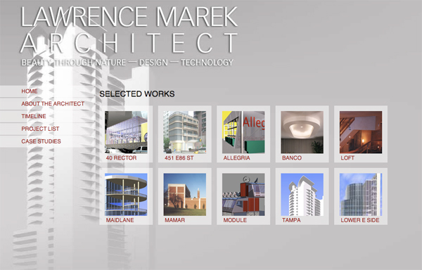
Portfolio pages tone it down to warm gray to let the art speak.
Portfolio site for the New York architect.

The home page uses an arresting red to create a sense of redness.

Portfolio pages tone it down to warm gray to let the art speak.